Having a Global Accessibility Awareness Day is one way to encourage accessibility in your organization. It can also be used to touch on related concerns like digital strategy, return on investment for web content, and usability more broadly. I have summarised my presentation below (I have removed the Powerpointiness and specific examples from my workplace but you should still get the gist of it).
What was covered
-
What is web accessibility
-
What’s in it for you - cost/benefits
-
The digital context
-
How I can help you
-
What you need to do
What is web accessibility?
- Accessibility is about supporting people
“The power of the Web is in its universality. Access by everyone regardless of disability is an essential
aspect.”
– Tim Berners Lee (he invented the web)
-
Accessibility is about people not computers
-
Web accessibility supports equitable access for all
-
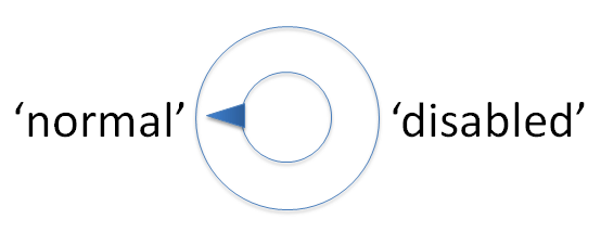
Accessibility operates on a continuum and is not binary. It is not a setting or a feature. It is an approach
-
Accessibility needs to be built into your content, design, and coding processes.
Computers have settings, people don’t
People have abilities
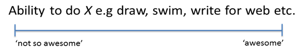
- Abilities are not static they are on a spectrum
e.g. My Monday morning brain vs. my Friday afternoon brain.
- The range of abilities people possess is very large and quite amazing
Abilities change over time, and can be effected by lots of factors, genetics, age, stress, etc.
Examples
-
People have varied abilities, including you
-
Glasses – anyone, anyone
-
After 40 general eyesight and ability to distinguish contrast and richness of colour will deteriorate
-
A very small % of women have four photo receptors in their eye so they can see colours no other human can see.
What’s in it for you
There are three attractive outcomes of supporting people and accessibility.
-
Dollars for you in the form of a pay rise
-
More satisfied users
-
Feel good about doing the right (moral) thing
You might get paid more
Building quality digital services is an opportunity to increase efficiency and reduce costs. Catering for accessibility can improve user experience outcomes for all. Accessibility improvements can lead to:
-
Increased number of users
-
Faster processing times
-
Increased number of repeat customers
These metrics can be used to negotiate a pay rise with your boss and demonstrate the value of an accessible digital service.
Your users will be more satisfied
You can be liked and perhaps even loved by your users rather than be identified with a frustrating and unrewarding digital experience
You will be doing the right thing
Catering for accessibility is about supporting equitable access, this is morally right, so you can sleep well at night.
Also if you include your internal systems it will make things easier for you and your colleagues too.
Digital Services done right can be a lot cheaper
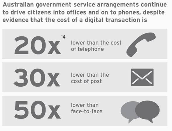
Source: AIIA SmartICT 2014 Infographic 1.9 MB pdf - quoting 14. Policy Exchange, (2013) Smaller, Better, Faster, Stronger, Remaking government for the digital age. p. 33
-
You can assume that digital services will be cheaper, but only when they meet user expectations.
-
You should also be wary of converting all services to self service. Many services are inherently complex. If you know your service really well often a composite model is best. This allows digital and
manual processes to complement each other.
Government has the largest 'opportunity' to improve
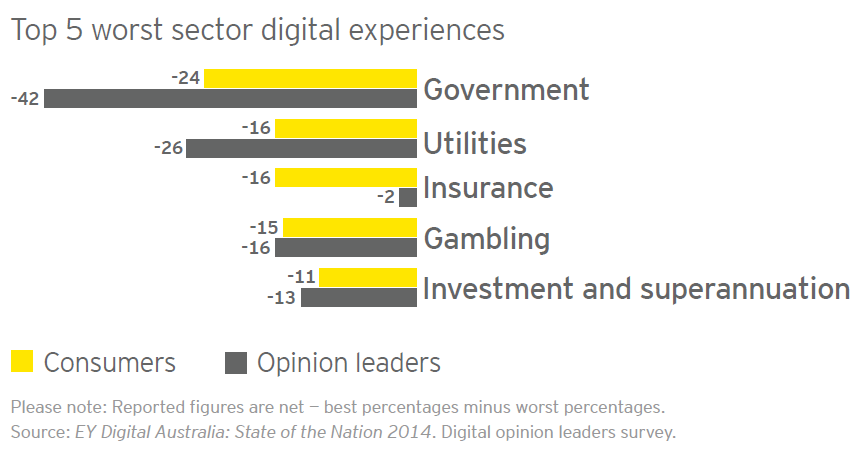
Source: EY Digital Australia: State of the Nation 2014, Digital Opinion Leaders Survey
Government has a particular interest in having it’s policies and regulations understood and followed
“’Government is complicated,’ say Richards. ‘Communicating government policy can’t be; we need to make it understood by anyone interested enough to look for it.”
Source: Nicely said: writing for the web with style and purpose, location 825, Fenton and Kiefer Lee, 2014.
Examples of usability/accessibility issues from a lack of digital strategy
-
Content no one is reading
-
Complexity and compounded cost
-
Too much cognitive load (Don’t make me think)
Content no one is reading
“...a study by the World Bank, it was found that almost one-third of their PDF reports had never even been downloaded once.
It is estimated that there are some 14 million pages on Microsoft.com. 3 million of them have never been looked at.”
Source: Pair writing: a revolution in content creation| New Thinking | Gerry McGovern January 2015
Has your organisation put a cost against their content? Do they know how much it costs to produce and critically to maintain. In my experience these costs are often poorly understood.
Also are you measuring the benefit of your content? If no one has looked at the page or downloaded the report (even if it is excellent and important) then you are wasting time and money that could be spent elsewhere. It may simply be that another channel is needed to get your content to the audience.
Complexity and compounded costs
“…everyone wants their job to be easier, and everyone wants their website to be as useful as it can
be with as little time/effort/training/expense as possible.
Unfortunately, punting to PDF is only easy for you; it shifts the effort to your visitors. ...I just don’t care is their most likely response.”
Source: Christopher Mackay’s excellent article Publishing PDFs: a web content microcosm | Tantramar Interactive Inc., December 2014.
Reducing the workload of your team by lowering quality or not taking the time to simplify your content for your audience can create compound problems. Often adding an extra week or two to your project would allow a cycle of user testing. Yes it does cost money.
However, if you introduce a convoluted work process or hard to understand document that is used by thousands of staff or customers then that problem is compounded. The cost is amplified and borne by your organisation again and again.
It is much more effective to put in the time to do the job right the first time.
Processes that are too complex
“The experience of shopping for a mobile-phone plan was so painful that I wouldn’t wish it on my worst enemy”
Source: Shopping online for an iPhone plan is painful | Nielsen Norman Group, Katie Sherwin, November 2014
If your processes are complex consider reworking them. This takes place outside of the realm of technology and is often where difficult issues can finally be resolved. Taking the time to simplify and stream line processes will pay off.
Too much cognitive load (Don’t make me think)
Example of poor link names and web writing

What’s wrong?
- Too many choices
- Making the user do all the work
- Also all the links are described as ‘here’ even though they link to different things.
- Locational and device dependent references in text. These should be avoided for accessibility
- Can’t complete process within the dialog. You have to follow multiple steps on other sites.
Note: Some of you may also note the age of this application hinted at by browser optimisation for IE6 and FireFox 1.5.
Quantify experiences not people
“Let’s stop quantifying people and instead start quantifying experiences.”
“If the content doesn’t make sense when it’s heard, then it probably isn’t clear when it’s read.”
Source: Reframing accessibility for the web, A list apart | Anne Gibson, February 2015
- Quantify the digital experience you provide
What affects the digital experience
Layers
-
Text and images – the content
-
Semantic (Information) structure
e.g headings and navigation elements
-
Presentation ‘look and feel’ – colour, typography, layout
-
Behavioural – user interaction, psychology
When considering accessibility we need to consider the layers of the web.
- Accessibility is about providing options to access these layers through varied modes of use: examples include keyboard, visual, audio, touch, etc.
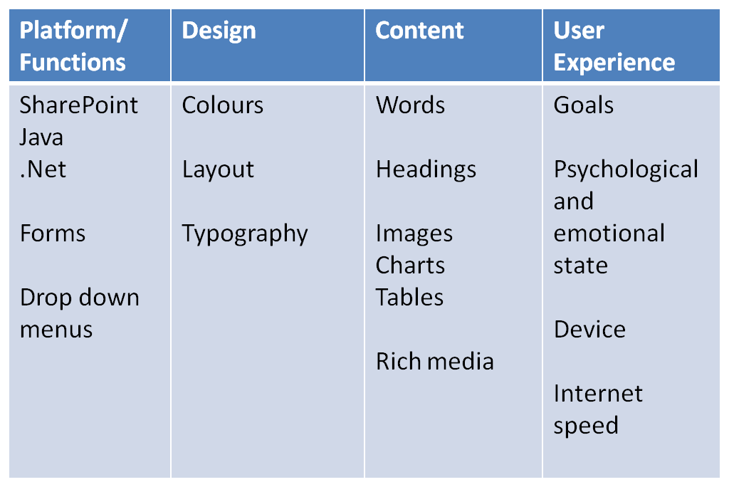
Additionally I often break down accessibility and where it manifests into four categories:
- Platform/Function
- Design
- Content
- User Experience (UX)
All of these areas need to be aligned so that both business and user needs can be met.
Semantics or information structure
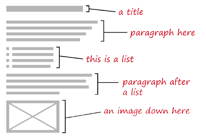
Source: p. 8, Apps for all: coding accessible web applications, Smashing Magazine, Heydon Pickering, 2014.
Providing an effective semantic or information structure for digital services is critical to meet accessibility and usability requirements.
Headings – as landmarks
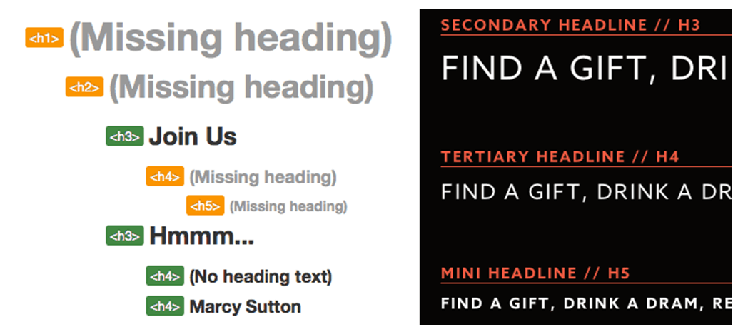
Source: How I audit a website for accessibility | Substantial | Marcy Sutton, July, 2014. In this article Marcy Sutton a developer and accessibility advocate, shares how she developed an accessible whisky drinking guide site
Headings are important for screen readers
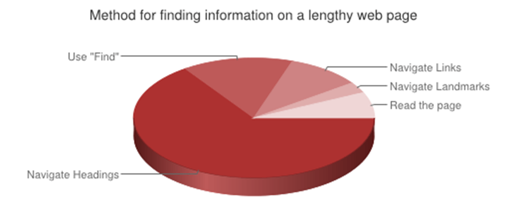
Question: When trying to find information on a lengthy web page, which of the following are you most likely to do first?
Answer: 65.6%(941) of respondents navigate through the headings on the page.
Source: WebAIM Screen Reader Survey 5 2014
Headings and navigation are important for everyone
“ 74% of respondents indicating ease of website navigation as an important factor in providing a high quality digital experience across all sectors.”
Source: EY Digital Australia: State of the Nation 2014. Digital opinion leaders survey
Cognitive Load
“Willpower and cognitive processing draw from the same pool of resources.
“Help them [i.e. users] conserve and manage their scarce, precious, easily-depleted cognitive resources for what really matters.”
Source: Your app makes me fat |
Serious Pony, Kathy Sierra, July 2013
Note: Cognitive processing equals thinking, thus cognitive load equals thinking hard
If your digital content is hard to use it reduces will power. Leading to less completion of tasks, and perhaps more unhealthy snacks.
They did a study on this asking people to remember a 7 digit number and a 2 digit number. After the activity those with the larger number were 50% more likely to choose cake than 2 digit number memorisers.
Do you know what a hamburger menu is?
If you don’t then you will probably have cognitive load issues when using your mobile.
![]()
Source: Kill the hamburger button | Techcrunch, Josh Constine, May 2014.
The hamburger icon is three bars typically used to represent a menu in a mobile application user interface. To remove ambiguity writing the icon function (i.e. menu) is advised.
Time Magazine did a site relaunch a while back without it being labelled. They had such a reduction in its use that they subsequently added this pop-up explaining what the icon did.
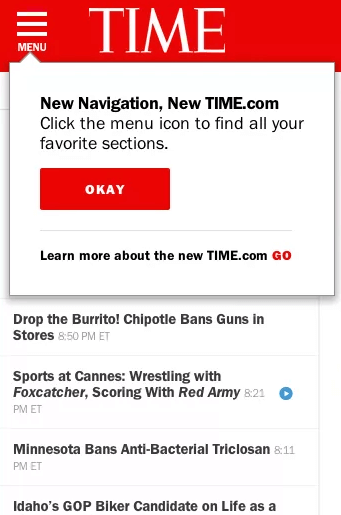
Source: To hamburger menu or not? Web publishers' new addiction to hiding navigation | Digiday | Ricardo Bilton, May 2014
Source: Hamburger menu: Handy tool or useless icon? | MOOVWEB, 2015
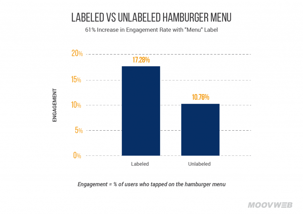
Studies have found that a labelled hamburger menu is more effective
Some of the larger digital services (hello Facebook) are moving away from using the hamburger menu at the higher level and replacing with more specific controls especially at the bottom of the phone where people typically use their thumbs to navigate, browse and select controls, content etc.
![]()
Source: To hamburger menu or not? Web publishers' new addiction to hiding navigation | Digiday | Ricardo Bilton, May 2014
Colour
“In a study titled ‘Impact of Colour in Marketing’, researchers found that up to 90% of judgments about products are based solely on colour.”
Source: Things UX and UI designers could learn from Wes
Anderson | Fastcodesign, Sumit Mehra, August 2014
- Use of colour is important but don’t use colour alone to convey meaning.
If you take a progressive enhancement approach to design you can avoid issues. Try designing in monochrome of greyscale first, before nailing the colour palette
Contexts of use also vary
Source: The story behind the bbc mobile accessibility guidelines | Iheni Blog 2014
Displays vary - here are the current Apple display devices

Source: Unknown, please let me know if you know the origin of this image.
Devices vary, browsers vary, resolutions vary
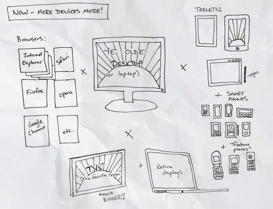
Source: The Rise of Content Strategy—Trend #2: More Devices! More!, Merrill (2012)
Orientations vary
Source: Unknown, please let me know if you know the origin of this image.
Multiscreen use varies
Source: Multiscreen patterns Stoll (2011)
How I can help you
Provide advice on:
-
aligning function, design, and content strategy
-
on the digital context
-
training on content strategy, accessibility, user interaction design, web governance, and usability
-
user research and testing of web services functions, design, and content
What you need to do
-
Measure your efforts - Consider how you are going to measure the success of your digital services. Pick metrics that tie to both your business and user goals
-
Understand the digital context - Educate yourself about the hidden costs of poor digital products and content.
-
Have empathy – design for your users and their varied abilities
“Accessible design requires empathy: it is the product of putting yourself in other people’s shoes. As Zeldman’s seminal book puts it, accessibility is ‘the soul of web standards.’ ”
"In other words costs or difficulties to the user should be given more weight than costs to authors [my emphasis] —HTML Design Principles, W3C19
Source: p. 6 Apps for all: coding accessible web applications, Smashing Magazine, Heydon Pickering, 2014.
- Align business and user needs
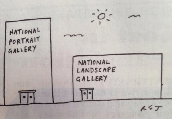
This well know internet cartoon illustrates the challenge of aligning organisation and user interests
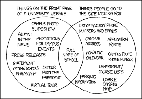
Source: xkcd: University Website
-
Avoid creating compound problems where possible
-
Write for the web – or seek help to do so
-
Communicate and collaborate!
- Don’t just throw things over the fence
-
Not communicating and collaborating... leads to more work and less efficiency for many of your colleagues and also your users
-
Align on common interests and collaborate to solve issues.
Yes it is hard and messy, but it is also so worth it. You get many new friends... And even if you can’t have friends make some new frenemies. :-)
Postscript
A (Rough) Manifesto for Accessible User Experience | Medium, Accessible UX, May 2015 – After my presentation I came across this I think it lines up nicely with my presentation and I may use it as the basis of my next presentation on accessibility.
You should definitely check it out.