Baskerville is more trustworthy than Comic Sans according to science

Image source: By GearedBull from the Wikimedia Commons
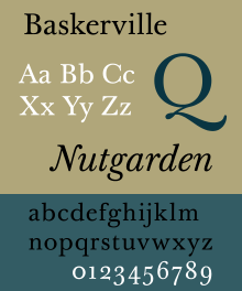
Image source: By Paul Hunt from the Wikimedia Commons
Make sure your fonts are easy to read
“If it’s hard to read, it’s hard to do,” they wrote—whether that “it” is taking a pill, remembering to exercise, or trusting NASA to keep us safe from an asteroid that’s flying a little bit too close for comfort.
Each time someone opened the original column, he revealed, the paragraph quoting Deutsch would appear in one of six random fonts, and the differences between them were statistically significant.
People who had seen Deutsch’s statement of reassurance in Baskerville were the most likely to believe it and the most convinced of their choice; at the other end of the spectrum, those who had seen Comic Sans were both less likely to believe and less sure of their answers.
Source: The healthiest typeface | The Atlantic | Cari Romm, March 2015
See also my previous post on Fonts, typography, and driving safety (June 2014)