Was nice to mix with a bunch of people passionate, informed, and entertaining about usability.
Had a bit of a crack and sketchnoting, but I haven't mastered portraiture yet so mileage on accuracy will vary significantly.
Sustainable User Experience (UX) intro
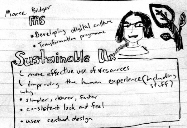
Maree Bridger kicked things off
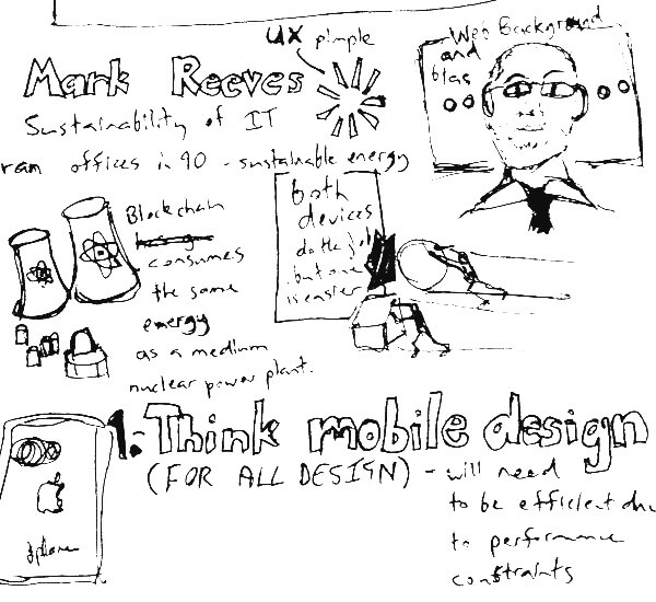
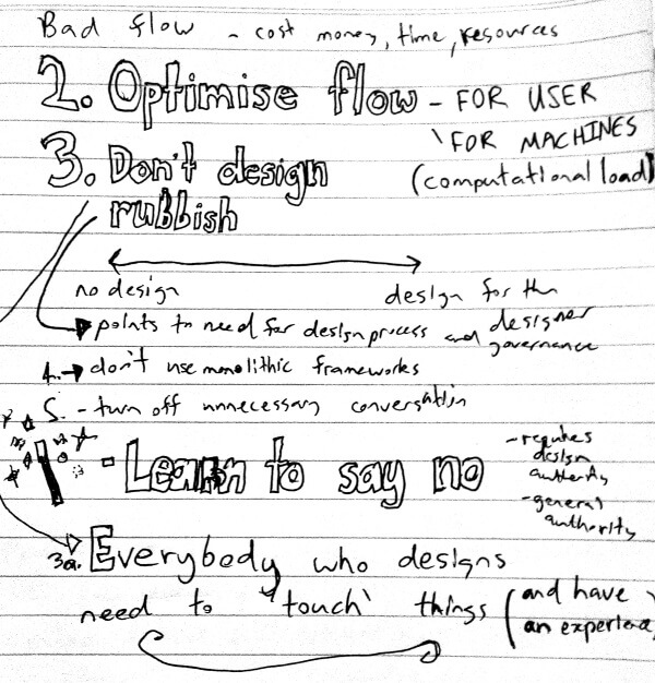
Mark Reeves - Sustainable UX - don't be part of the problem
Enduring UX
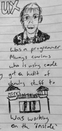
Colette Raison and Snezna Schmidt
First up was Snezna Schmidt who shared an interesting agile project model consisting of two development teams having overlapping sprints with one doing research and the other doing development and addressing issues co-currently.
This approach was good as it allowed the team to communicate closely and add more value in both the development and research phases. As they had a week 0 for research and the opportunities and user feedback was dealt with in each sprint the delivered outcomes were reached much faster than is usually the case.
Also this was a fixed cost approach rather than terms and materials but the quality of the final product exceeded the expectation of the business.
The top challenge in 2016
- Organisations have a poor understanding of how people use technology. However, most funding is spent on curating and updating information technology. [I would add that it is hard to make good decisions about updating IT if you don't understand how people are using it.]
- Project was agile and fixed price
- Supplier did everything
- Asked for UX to be delivered as a component
- Service - originally fragmented and very sequential
- Delivery model two overlapping teams
- UX phase included: user stories, research, contextual enquiry, field visits, letting suppliers talk directly with users and create relationships for feedback
- Validated things - did show and tell, testing components included user evaluation, with user profiles and scenarios in context of use
- The delivery was tied to user satisfaction metrics [Yes Yes Yes, finally someone measuring the right things :-)]
- Final result - intuitive system, more than expected functionality
- Key take away - start with users - trust the process

Collette spoke about her experiences doing UX guerilla style in addition to asked for Business Analyst work
- Executives are keen to demonstrable results of UX (so prototypes crucial). Especially at first they didn't see the value of user experience
- Best to provide a brief and presentations to Project Managers and Executives so they have a mental model of UX
- Non technical sprints were included covering, formulate project intent [the hardest one and often not articulated clearly], conduct user research, analyse and model, define requirements
- The technical sprints covered: co-design, build, final test, implement, evaluate (review) [this last one can't be done well if you have considered measuring your intent]
- Key take away "Don't forget the intent and voice of the user"
The researcher's blind spot: 5 cognitive biases we shouldn't ignore in research
Ruth Ellison

- Cognitive biases - these can lead to faulty decision making
Selection bias
How to deal with it:
- Recruit with multiple channels
- Recruit on behaviour
- Avoid professional respondents
Observer-expectancy bias
- How you frame your questions is very important [the abilities and capability of staff to do this effectively is often a weakness in form and survey design]
How to deal with it: - Triangulate research (use more than one research method)
- Use observational methods (what users say and do are two completely different worlds)
- Avoid leading questions (get some else to review focusing on whether the question is biased towards a particular answer)
Confirmation bias (the hardest one)
How to deal with it:
- Take the opposing view
- Don't just confirm your hypothesis, try and prove it wrong
- Be skeptical (or as it was put in the book Liminal thinking, try and have lots of ideas, but hold them loosely)
- Consider all evidence equally (cherry picking is not cool)
- Employ multiple user researchers
Group think and the bandwagon effect
- This is prevalent in focus groups (I agree with Erika Hall - Focus groups are worthless, because among other things focus groups to prone to social proofing)
Key point: Think about how vulnerable you are to bias.
Blind spot bias
- Means you will notice the biases of others more than your own.
- Listen with an open mind
- Always consider and assess your biases, and the challenges of biases in your chosen research method
User centred design for lean agile projects
Roger Worthy
- Agile - a different way of thinking
- Lean ways of working
- He spoke about the use of prototypes and importance of usability in this process.
- Lean agile comes from systems thinking, and product and process devlopment
- Lean agile focuses on maximising flow of value to the customer
- He also explained the the house of lean and how it aims to add value in a sustainable value in the shortest lead time.
The house of 'lean'
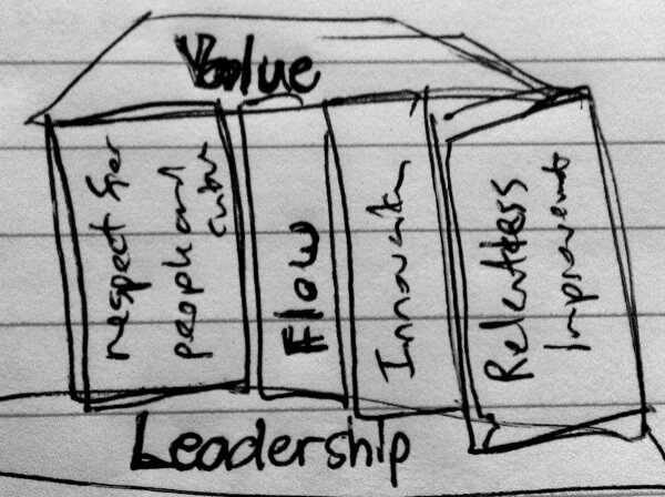
I think this a great development approach to deal with uncertainty and ambiguity. But there is a deep seated fear for executives and teams to admit they don't know and are not clear on a digital product or services development. The illusion of control provided by a waterfall approach to product development is still attractive to these parties.
Roger also mentioned a Nordstrom video he wanted to play to demonstrate agile prototype development I think it was this one.
The usability of everyday things
Rosa Quiroga

- Rosa introduced the ISO for human centred design. ISO 9241-210-2010
- She introduced the value of heuristic design review whilst stressing that heuristic review will never replace actual evaluation
- Heuristic evaluation is good to get identify pain points for usability though
- You should get to know your user
- To assess usability you should consider factors such as: Effectiveness, efficiency, and satisfaction
- Understanding the visibility of state is very important
- She introduced the Homer car example on the Simpsons to illustrate that having the opinion of one person driving design decisions can be dangerous.
Encouraging sustainability behaviour change at home: Lessons learned from Living Greener
Tracey Benson

- Tracey worked on a website (Living greener) that passed through many (about 5 is my recollection) government agencies that was designed to encourage sustainability behaviour change at home.
- They found real stories were good at encouraging behaviour change
- There research on their audience all Australians, found that average science comprehension levels are (year 5 level of understanding), and reading comprehension (year 6 level of understanding).
- She mad use of the work of McKenzie Mohr and her focus on community-based social marketing
- She also liked Unilever's 'five levers for change' which are basically make it:
- easy to understand
- easy
- desirable
- rewarding
- a habit
- To keep the content relevant she found it useful to check organic search terms and to develop contact in response to them
People interpret the design as content
This resonated with me and she mentioned that as different governments came and went and as agencies changed she could see how the design came to be viewed as the content.
How can government UX and service design contribute to sustainability?
David Heacock
Government doesn't give a crap about sustainability in UX but you can
Challenges
- Throw-away economy [centralised control and system not tailored to avoid reuse and duplication, project based funding models and working to budget cycles not designed for sustainability]
- Unrealistic expectations, 'hey I need my own car!'
- Expectation of choice of service channel
- Policy overload
- Policy inertia
I think David hit the mark on the challenges the biggest being existing beliefs in my opinion
Observations of behaviour
- People don't change to a new solution just because it is better, or cheaper. They change because it is easier
- There is strong behavioural inertia towards current ways of doing things, in both citizen behaviour and policy design
- Loss aversion bias means people are unlikely to change for a benefit if there is a loss for them
- Share economies (i.e. collaborative consumption) can improve resource utilisation. These can be shared processes or facilities.
- Calculating savings and linking to deregulation agenda can be a useful persuasive tool.
Canberra only works from the top down
- Best presentation typograpy award goes to Libero
